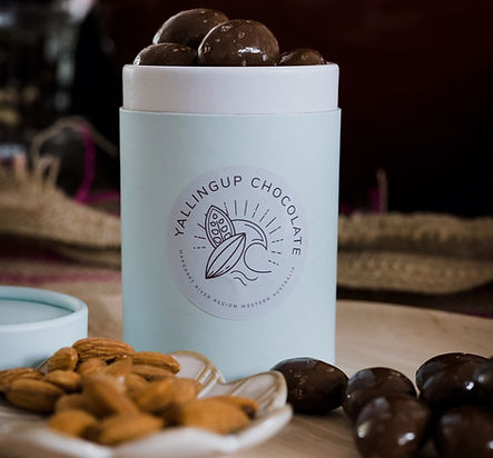
YALLINGUP CHOCOLATE

Yallingup Chocolate needed a fun and distinctive brand that captures the playful spirit of their products. To express their unique voice, we've incorporated a vibrant palette of bright pinks, blues, and rich chocolate tones, creating a lively and inviting visual identity.
These bold colours reflect the energy and creativity behind the brand, making it stand out while appealing to a broad audience.
The mix of playful hues and earthy chocolate shades also helps convey a sense of indulgence and joy, perfectly aligning with Yallingup Chocolate's mission to bring fun and flavour to every bite!
Designing the Yallingup Chocolate Brand was an exceptionally enjoyable and inspiring journey.The sweet indulgent nature of the products allowed for a playful exploration of colours, shapes and imagery. Designing the illustrations for the brand and packaging was honestly such a joy. I recommend if you are ever in Yallingup to stop in to their Chocolate Factory and Cafe!
Credit Freedom Garvey Photography for the amazing professional photography featured in Yallingup Chocolate's advertising materials.
https://freedomgarvey.com.au/


